Stop and think of the role colors play in our daily lives for a moment. Colors can influence everything from what you wear to the car you buy. Colors can trigger emotions, memories, even hunger. Certainly, colors and patterns matter to companies advertising and selling products. Communicating with customers in the manufacturing world about selecting an exact color, however, has proven challenging enough as to require a particular system, known as the Pantone Matching System.

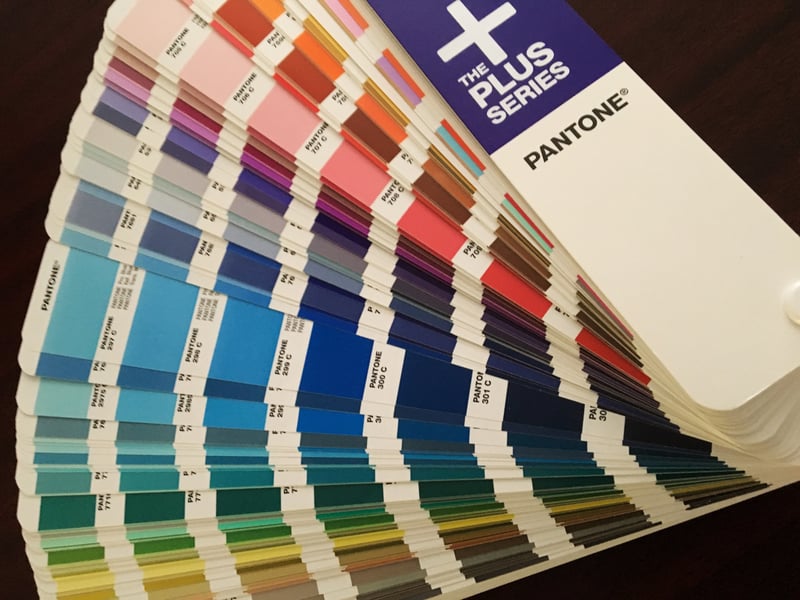
Example of Pantone Color Book
Membrane switches, graphic overlays, rubber keypads and other style human-machine interface (HMI) products are what the end user sees and touches. From a brand perspective, the Company logo and/or colors used in the product are very meaningful. I think we are all familiar with some big brand consumer electronics products and what their logo and color scheme looks like. Getting that color consistency across all products requires the use of a Pantone Matching System.
When a customer asks, “I want my color as bright and blue as the sky”, it isn’t likely we could match their blue sky. Sure, blue is blue but only the customer knows their specific color. Regardless of the color is on an existing product or a paint chip, it is virtually impossible to match the color .
Consistency In Your Products Brand
What customers should be asking is what standard can I use to make everything match? The answer is with the Pantone Matching System, a global color-coded exact matching system.
By definition the Pantone Matching System is a proprietary color space used in a variety of industries, primarily printing, though sometimes the manufacture of colored paint, fabric and plastics. In manufacturing it is common for color to be used on membrane switches, graphic overlays, and rubber keypads all of which can be supplied in a variety of colors, multiple colors, and finished textures. Pantone matching is also used in legislation, government, and military standards for items such as flags, uniforms, equipment or documentation. The Pantone Matching System color match allows designers to choose a color that will always match.
Pantone Matching System For User Interface Assemblies
The Pantone Matching System is a science of color shades that allows for manufacturing to reproduce the same exact color every time. Referring to a Pantone color on your first order allows a match from sample prototypes to production runs and from lot to lot no matter the length of time between orders. It is a standardized global reference guide that will not change the outcome of your product.
All Pantone Matching System colors have an associated number as part of the reference guide. For example, referencing Pantone 300 C will always be 300 C. Accurate documentation for membrane switches, graphic overlays, or labels will never look different as long as the proper matching system is used as a color guide. Color variation or changes no matter how subtle side by side, there is a difference so refer to Pantone Matching System when making important decisions about your colors.
Summary
If you want your user interface product to look consistent with your company's branding, then you need to check with your user interface manufacturer to ensure your pantone colors are being used correctly.
Purchasing a Pantone Matching System Swatch book from PANTONE® is an important tool for engineers and designers to always know what color to use on a product to match the next version. To learn more about colors by Pantone visit www.pantone.com.
Key Takeaways
- Color consistency is essential for branding: Logos, overlays, and keypads must maintain exact colors to support brand recognition and customer expectations.
- Subjective descriptions aren’t reliable: Requests like “sky blue” cannot be matched accurately; a standardized system is required.
- Pantone Matching System (PMS) provides exact matches: Each Pantone shade has a unique number that ensures the same color is reproduced across products and production runs.
- PMS is widely adopted across industries: From manufacturing to printing, fabrics, plastics, and even government standards, it’s the global benchmark for precise color reproduction.
- Documentation and swatch books prevent errors: Referencing Pantone numbers in product specs ensures consistency, while engineers and designers should use Pantone swatches to avoid variation.


